Using Boxplots for Data Visualization and Process Insights
Effective data visualization helps leaders see what raw numbers hide. This post shows how boxplots bring clarity to process data, revealing variation, outliers, and trends that support better decisions and stronger continuous improvement outcomes across manufacturing, logistics, and service operations.
Strong decisions require clarity, not complexity. Data visualization helps leaders see the story behind the numbers. One of the simplest yet most powerful tools for this is the boxplot.
Boxplots summarize how a process behaves over time, showing variation, stability, and outliers at a glance. When used correctly, they highlight where performance is consistent and where hidden problems exist.
Understanding Boxplots
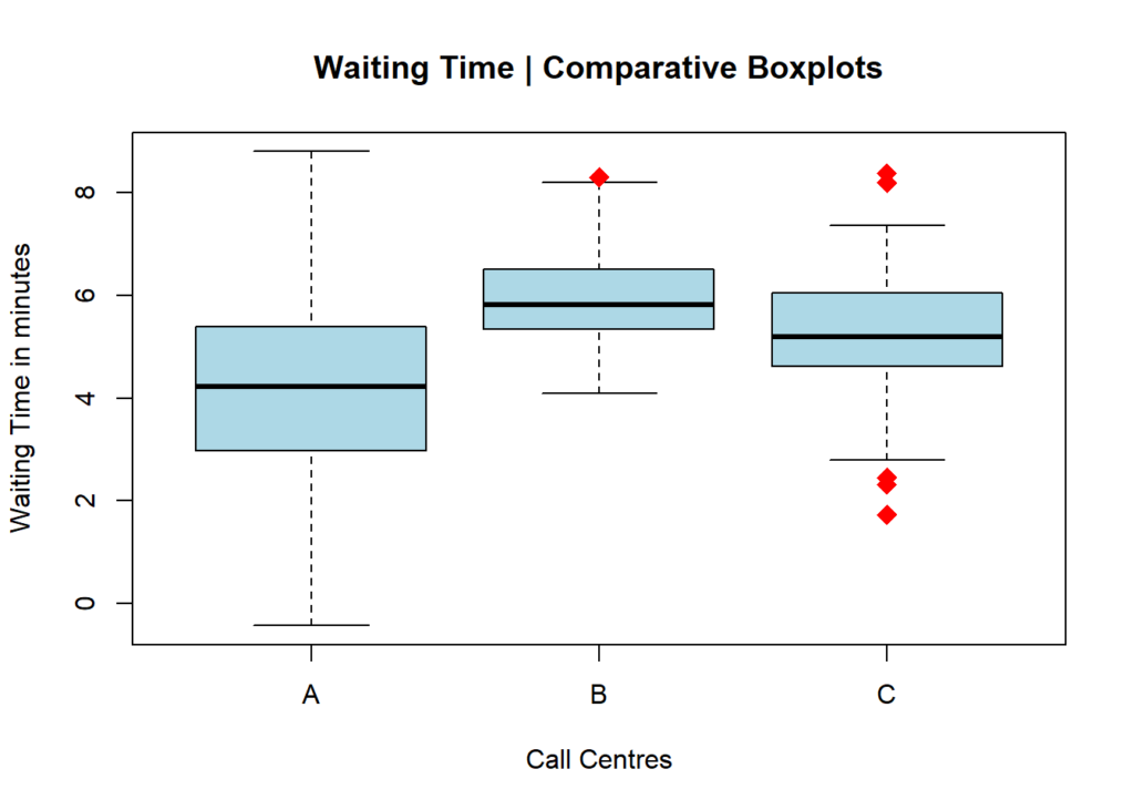
A boxplot divides your data into quartiles and displays the five key points of a dataset: minimum, first quartile (Q1), median, third quartile (Q3), and maximum. The “box” represents the middle 50 percent of your data, while whiskers extend to the smallest and largest values.
Outliers appear as dots outside the whiskers, signaling exceptional values worth investigating.
Boxplots are ideal for comparing datasets – for example, comparing plant performance, supplier delivery times, or customer wait times across regions.
Why Boxplots Matter in Data Visualization
Raw data tables are difficult to interpret, but a boxplot instantly shows how stable or variable a process is.
A tall box shows high variation.
A narrow box shows consistency.
A median far from center signals skewed data.
Outliers show where exceptions occur.
By transforming raw data into visuals, teams can see problems faster and prioritize corrective action.
In Lean Six Sigma and continuous improvement, boxplots help detect variation that leads to waste or rework. For instance, a manufacturing team can compare product dimensions from multiple shifts. If one shift’s boxplot shows higher variation, that points to inconsistency in setup or operator technique.
Similarly, a service team can analyze call duration by agent group to identify training needs or workload imbalances.
Cautions When Using Boxplots
Boxplots are powerful, but they can mislead if used incorrectly. A boxplot built from very few data points can look identical to one based on hundreds. Always pair visual tools with descriptive statistics to confirm what the chart suggests.
Also, adjust your bin width and scale consistently when comparing multiple boxplots. Differences in range or measurement scale can distort interpretation.
Boxplots are more than a visualization tool, they are a decision-making tool. By combining data visualization with statistical reasoning, leaders can uncover the truth about performance faster and focus improvement where it matters most.
At Adonis Partners, we help organizations make sense of process data through structured analytics, Lean Six Sigma, and visual management methods that convert insight into measurable results.
I love Continuous Improvement and Data Analytics. The world would be a better place if our kids were taught more process excellence and statistical analysis at school.